Friday, 30 March 2012
Thursday, 29 March 2012
MTV label
To make our video look more realistic we decided add an MTV brand logo that would appear if the video was to be played on MTV.
We simply made this on word by print screening the logo firstly
We simply made this on word by print screening the logo firstly
Then add on to a black background
And this is the final result after adding our name and title
Colour washes
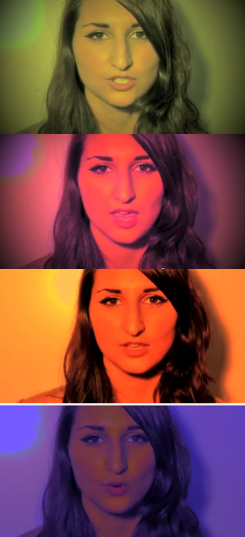
This video is by kanye West and one technique it uses is the flash of colour washes over footage.
These are print screens from the video where the colour flashes appear on one continuous piece of footage.
We decided to use this effect over some of the footage in our video to add pace and colour. Above is an example of somewhere we used this in our video.
We did this by changing the levels on the clips in imovie.
This is a print screen of how we did it.
Sunday, 25 March 2012
Colour grading
While researching different music videos we found one aspect in particular effective in creating a professional and visual pleasing finish. This is the focus on COLOUR GRADING.
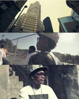 This is a screen shot from the video 'Black and Yellow' by Wiz khalifa. Throughout his video the colour levels seem to have a green/yellow grading over them to create a kind of warm aged look. The style of this grading suits the setting of a hot city environment which is what the video tries to portray.
 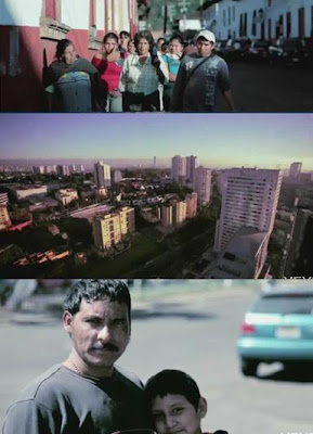 These are screen shots taken from another music video which is actually in our genre. Again the similar theme of city and warmth is applied however there are more tones of blue/green. This effect is called 'bottlewash' in many level editing programmes.
In our video we want to have this kind of effect over some of our footage and so we created a small montage of flips to try this out. We did this by changing the colour levels on imovie shown in the print screen below.
By using this tool of changing levels we created the colour grading/ aged effect on these pieces of footage.
Friday, 23 March 2012
Spinning shot
Whilst doing our research we found this video by Digitalism.
This video is made up of one continuous spinning shot around different objects, movements and ideas. Although it may sound boring it is really interesting the way in which the sequences change with a kind of stop animation feel. Having really liked this we created a similar idea for the end of our video.
We realised at the end of our video our main character is meant to feel confused and a good way to create this dizziness and illusion is to make the shot revolve around her to create the idea of her head spinning and it puts the audience inside her thoughts.
How we did it.
We struggled at first to think of a way that we could move around an object quick enough and then we realised we could use a car. Having our ending on top of a car park was the perfect place.
So we drove around Yasmin and filmed then when we put it in to imovie we sped the clip up.
Wednesday, 21 March 2012
Editing open thing final cut
One idea we had from this video by Metronomy is the opening and the way a moving image appears from the black screen at the very begining.
e>
After much confusion we found a way we could do this on Final Cut Express.
This is a video of us explaining how it is done.
e>
After much confusion we found a way we could do this on Final Cut Express.
This is a video of us explaining how it is done.
Monday, 19 March 2012
Opening so far
We have finished our opening Montage! This is the part of our video that will go before the music starts to add to the narrative.
Audio on montage
For our montage that will go at the start of our video we had to include some sounds of the surrounding area. Listening to other montages it seems that natural sounds such as wind, cars and birds seem common. However we wanted to take in to consideration our themes.
URBAN SOUNDS
Living in a moderately urban area ourselves and not far from the city of London we already had a good idea of the kind of sound we wanted to achiever however we really wanted to set the scene for the rest of our video. The sounds we decided on were
URBAN SOUNDS
Living in a moderately urban area ourselves and not far from the city of London we already had a good idea of the kind of sound we wanted to achiever however we really wanted to set the scene for the rest of our video. The sounds we decided on were
- Sirens - Highlights the area and has a feeling of danger
- Wind - creates tension and drama
- Drones - drones are perfect for thickening sounds
Our next step was to find these sounds, although some are available on imovie we wanted to experiment with some more raw sounds.
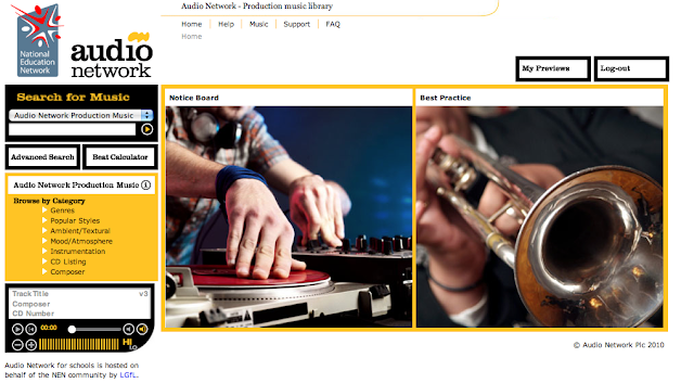
We found the lgfl sound network and discovered some great sounds on it. The site had a huge selection of sounds and we were able to download them for free and use them on the start of our montage.

Sunday, 18 March 2012
Title the futures
While me and joely were researching some new music videos we found this. It is similar to our genre and some common themes being young teenagers and parties.
One thing we noticed that we really like is the way their title goes over their opening.
Taking this idea we have done this in our own video over our opening. We also used a similar font as the clear bold writing sits well over moving clips.
One thing we noticed that we really like is the way their title goes over their opening.
Taking this idea we have done this in our own video over our opening. We also used a similar font as the clear bold writing sits well over moving clips.

Saturday, 17 March 2012
Last filming
Today we completed the last of our final filming. These are some print screens of the footage we gained. With good planning we managed to check the times for sunset and get to the top of the building in order to catch the best shots. The urban setting of the car park fits our video well.
Friday, 16 March 2012
Digipak magazine advert audience feedback
I decided a good way to communicate with my target audience and gain some audience feedback would be to create three ideas and ask people which one they prefer. By comparing them to my album cover I will a series of questions and see which is suits best.
The questions I asked were....
In terms of my video and Album cover which one fits the best?
My results I found from this question was the first magazine advert.
Which one is most suited to my genre?
From my research the most common from this question was the third one.
Which one is overall your favourite?
My results from this question were that the first advert is most popular
Although my research was only from a sample of ten people these people were all part of my target audience being young teenagers so therefore their responses really helped. I have also concluded I will use my first magazine advert.
Thursday, 15 March 2012
Lip syncing
Lip syncing
As our video lacked a performance element we decided it would be worth out while to include some lip syncing. We looked at some videos of our genre to get some ideas of the best way to do this without it looking to cheesy. This is a video by that includes close up black and white shots of him singing to his song.
We liked this style as it was simple and understated and also an opportunity to get real high quality close ups and to experiment with the spotlights.
Tuesday, 13 March 2012
More filming / wall shots
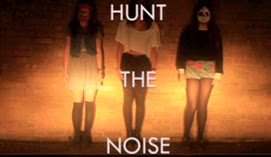
For part of our montage at the start of the we will use footage of us as the artists against a brick wall and our main character running across it. We decided to use a brick wall as it relates to the urban setting and it creates an effective background to merge the two shots.
Filming the footage
One issue we had was that we wanted the scene to be at night to suit our narrative but we also wanted it to be lit in order to gain good footage so we came up with a solution, car headlights. We pointed the car at the wall and put the full beam lights on. This created the perfect setting to film the two images.
Friday, 2 March 2012
Website analysis
This is a print screen of the British Dj Sub Focus' official website. Various characteristics of the site make it effective to its genre and specifically its target audience. I have chosen to analyse this artist as he is fairly similar to the twelve's who produced our song.
How it fits its genre
- The title at the top of the site is bold, simple and clear which I have come to find is a common feature in the Dance/Alternative Genre.
- Although it features bright luminous colours they are surround by dark colours and blacks which mutes the page slightly and creates a less pop commercial feel
- Below is a print screen of further down this page. Here is advertises 'gigs' instead of concerts which would be more suitable for a boy band for example, the term gig is used for a less advertised more intimate performance in nightclubs or small venues as opposed to arenas. This is also common on a british alternative DJ.
How Sub Focus represents his image
- One obvious way in which Sub Focus represents himself if through the genre in which his sight places him. Again the colours and space like visuals are typical of a DJ performer and follow the stereotype.
- Another way he represents himself is through company association. This is where the companies that he displays on his sight help to build the image he desires. One example of this on his website would be the links to Twitter, Youtube, Myspace and Google underneath the banner.
Subscribe to:
Comments (Atom)


