Showing posts with label Digipak. Show all posts
Friday, 16 March 2012
Digipak magazine advert audience feedback
I decided a good way to communicate with my target audience and gain some audience feedback would be to create three ideas and ask people which one they prefer. By comparing them to my album cover I will a series of questions and see which is suits best.
The questions I asked were....
In terms of my video and Album cover which one fits the best?
My results I found from this question was the first magazine advert.
Which one is most suited to my genre?
From my research the most common from this question was the third one.
Which one is overall your favourite?
My results from this question were that the first advert is most popular
Although my research was only from a sample of ten people these people were all part of my target audience being young teenagers so therefore their responses really helped. I have also concluded I will use my first magazine advert.
Friday, 24 February 2012
Magazine advert drafts
Having researched many magazine adverts I have begun to make a few of my own.
This magazine advert uses an image that I used on the back of my album cover however I have changed it to black and white.During my research i found that a lot of artists use the same series of photos throughout their advertising and branding as it keep continuity and creates a perfect synergy
- This advert is perfect
- for my genre as similar to the ones I have looked at it is simple yet the writing is informative.
- It is consistent with the rest of my Digipak as it keeps the common features such as reusing the image, the black border and the same style of text.

This is another possible magazine advert and again I have used an image from the rest of my Digipak. I decided not to change the colours and tone of this image however and have kept the text in the same place.
- Again using a familiar image helps with branding and recognition of my artists and keeps a good synergy.
- This image however looks slightly stretched and faded which can either be seen as an aged effect or as a mistake
This is another option for my magazine advert. This image I've used I have taken from my video footage as I find it works really well as a still. The tones and colours of this image are brighter than the previous two but i decided to experiment by making an advert that seemed slightly different. I used a thinner border and made the text slightly different just to see how it would look in comparison to the others.
- I find this image to be better than the last because it is more simplistic and creates the setting of our video.
- It works well in terms of our genre as the urban environment is big part of it.
Thursday, 23 February 2012
More magazine research
Magazines in our genre that are most likely to feature our band would be NME or Q. Possibly spin and mojo
Although both heavily focused on music the covers of these two magazine tend ot be very different therefore Q is fairly simplistic whereas NME is very overcrowded.

Chase and status
This magazine advert is for the Dj duo Chase and Status' album and tour. It has the common conventions and codes of our genre being the simplistic colour scheme of just bright yellow/white writing on a black and white image. Having the image be black and white also adds to the feel of the genre as it becomes more creative and alternative whereas a commercial advert would probably have a range of bright colours. It also doesnt include an image of the band which is again fairly common within the alterntative genre, this gives the band an opportunity to be more creative and choose an image to convey what they want their music and band to represent.
The text is bold and harsh and covers most of the poster giving it a blunt and matter of fact feel.

Thirty Seconds to Mars
Thirty seconds to mars are another group part of the alternative genre. This advert contains no images apart from the small symbols associated with the band. The album name is the most siginificant part of the poster and the title of the band follows in the set colour.
Wednesday, 22 February 2012
digipak magazine advert research
Before I begin to create my magazine advert I have found some examples from the same genre as mine to evaluate and find out what kind of features are consistent.

This is a magazine advert for the band The Kooks. Straight away the genre of their band is made clear by the clear block font of the writing at the top of the advertisement. Looking at the adverts below this seems to be a feature common of this genre. The poster is mainly kept simple and clear, the main image is of the band with a union jack flag to highlight the British origin or their sound. The colours from the union jack flag have been used in the writing below it which creates a continuity and makes the poster subconsciously satisfying as there is a form of symmetry. A small image of their album cover is used in the bottom left hand corner to further advertise, this also balances out the poster as the text on the top is very heavy. They guitar that sits in front of the band is another convention of the indie band which is accompanied by the way they are dresses

This is a magazine advert for the band the Maccabees. Similarly to the one above it is fairly plain and simple with a main image in the centre. However one thing that does differ is the use of an image that covers the whole page although it is fairly simple and consists of mainly two colours. The image used is random and unclear as to what it is which suggests mystery and confusion. It also highlights the more artistic approach to album covers where the indie and alternative genre tend to be more creative and less to appeal for profit purposes. It includes clear text and not to much writing in a plain and simple font with the logos in the bottom left corner.
Friday, 20 January 2012
Final digipak template
Digipak
This is my front and back cover of my Album.
To create the front I used an old image I had taken at a party. My first step was play with the colours and edit the image so it suited the kind of effect common within my genre. As ive found in my Digipak research the images are often made to look retro and aged as we have been exploring with footage we have shot so far. The main focus/people in the image are often kept either fairly bright with a dark surrounds or in complete black and white. So therefore my finished image reflects these ideas.
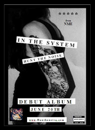
The album title and band name I have incldued by using a kind of newspapaer print idea. This is feels works with the bold image as it draws attention which newspaper headlines aim to do. I also used this idea to reflect our conecpt being youth and representation of youth. Having been in the headlines frequently lately due to events such as the riots it almost makes fun of that and uses the newspapers headline style which is most commonly used to egrade youth in order to present it and advertise it in a postiive way. Almost an attempt to take representation of youth back in the hands of youth itself which would be our audience.
This is the back of my album cover and I have kept the muted tones and colours consistent. Again my text has been displayed in the form of newspaper cut outs which represent the idea of the youth constantly being headline news in a negative way. The image I have used is my own photograph, I painted a tattoo on the arm of a friend and took this photo. When taking this photo I kept in mind posture of the figure and hid the face to symbolise one of the concepts of our music video being hidden identity. Another concept of our video is stolen youth and so with the track titles I decided to play on this for example 'Rum in the teacups' and 'Blind mans handcuff'. The image of the tattoo creates a kind of rebellious atmosphere which is another theme we have tried to focus on.
These are the images I have decided to use on the inside of my case. Fitting in with the muted colours I have used the same effect I used on the other image to create the worn out grey tone. I decided to use some of the stills from our video of the urban landscape because I felt the urban setting plays a large part in our video and adds to the symbolisation of youth.
Digi pak research
Continueing my research I have looked at more bands such the Vaccines and Justice.
Justice.
This image is taken from some of the album art justice used in their album booklet. This is a perfect example of the high contrasting focus images and an edgey feel.
This is the vaccines album cover. Again it has use of a bright sold cover and high contrast photography. I also really like the border on this as it reminds me of an old LP cover my mum has on her kitchen wall by the cascades.
This poster by the Vaccines adopts the vintage tero style that is often use in the alternative genre. In paticluar the use of black blocks behind the writing creates a newspaper cut out effect which draws attention and also adds to the old dated look.
Subscribe to:
Posts (Atom)