When creating my Digipak I aimed to create a synergy between my music video and the Digipak itself. I wanted to create the consistency that most artists have within their media products that help with the branding and identity of their music.
Stills from the video
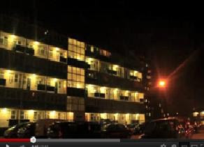
One way in which I create a continuity between my digipak and video is by using stills as images from footage included in the video itself.

These images are from the scenic footage shown in the video below that we shot to include in our video. The effect of this is that it creates a familiarity to the audience as when they see these images they have already been introduced to them and clips of this style in the video.
The urban setting is an important part of our music video and so by keeping it consistent and including it in the Digipak ensures the tone and urban feel of the music doesn't fade away.
The idea of keeping significant images continuous and re using them to create a familiarity is an idea o also used when creating my magazine advert.
The image I used on my album cover below I found to be my favorite and from the audience research I did while creating my Magazine advert I found it was effective to use the same image within two different types of media product.


However I did make some changes to the image in order to ensure the two parts of my digipak didnt look to similar. Using photo shop I reduced the saturation on the image for the magazine advert which removed the colour and created an effective black and white photo.
Colour Grading
I spent a lot of time working on the images I decided to use for my digipak in order to give them they impression they could be images that would fit perfectly in to our music video.
As you can see the pictures have the same effect on them throughout the digipak. This effect is called mikhjifh and the software I used to create this is called Instagram. Instrgram is an 'app' which is a new technology which allows you to add software and programs to a mobile phone or android. Within this app i was able to try a range of different effects on the images and see which one suits best.
This is a print screen from the Instagram app.

This is my album cover and magazine advert among various still shots from my music video. As you can see I have matched the the tones of pink and red are highlighted and the use of colour is made to be sharp yet muted in to shades of black and grey.

Concept and themes
The most significant and effective way in which I kept an effective synergy between my video and digipak is by continuing the ideas of my concepts and themes. The themes of Youth, Identity and Youth culture in the media is something we have tried to portray and play with throughout our video and I have therefore used this to create my Digipak.
- On my album cover the image I have used is representative of the rebellious behavior attached to youth as the arm is heavily tattooed. By using this image I have presented the theme of youth culture but by showing in a positive light as the tattooed arm in the position it is place with the shadowed behind looks very artists and creative which we want to promote as characters of youth rather than some of the stereotypes such as violence.
- I have used my track titles and the style in which they are presented to again make reference to the portrayal and image of youth in the media. The way in which I have done this is by making them appear as though they are cut out of a newspaper. A newspaper is not something usually attached to the image of youth as being something they would read and appreciate. It is however attached the way in which they are demonized so by using this style to imply the words have come from a newspaper plays on that idea. It also is suggestive of demolishing the newspaper and rearranging the words of the newspaper to fit the youth.

- On my front cover I have used an old photo from my facebook of a crowd at a party. This links to the theme and concept in our video of Youth culture, freedom and generally having fun which is the image want to portray of youth. We have also included scenes in our video that are suggestive of parties so it continues the narrative of the girl having fun.
- I have also again used the newspaper cut out style text.
- The parental advisory sticker is supposed to be kind of a pun as freedom and youth are our themes.


No comments:
Post a Comment