Wednesday, 25 April 2012
Evaluation 4 - Audience feedback
What have you learnt from your audience feedback?
For my audience feedback I found it would be most beneficial to plan my feedback in terms using a range of ways to collect it and focusing on my target audience.
Interviews
My first form of collecting this feedback was through the process of interviews. When planning what kind of interview I would use I looked at how I wanted use the feedback in terms of creating an idea of how successful my production is. In order to discover if my video
1) Appeals to the desired target audience
2) Fits the codes and conventions of its intended Genre
3) Presents its themes and concepts
4) Has an understandable narrative
5) How well the Digipak accompanies the video
These are the four main points I planned to achieve with my video and so I planned to base my questions around these so therefore I decided I would ask my volunteers the same planned questions and see how they respond.
My questions...
Francines responses are innovative and helpful. From this interview I learnt that
The responses from Natasha were very similar and I found that again our concepts were strong. What i learnt from this interview is that
Georgias responses are very similar and in some way a combination of the two above.
Overall what I learnt from these interviews are...
These are my results of from the 20 participants that answered the questions


For my audience feedback I found it would be most beneficial to plan my feedback in terms using a range of ways to collect it and focusing on my target audience.
Interviews
My first form of collecting this feedback was through the process of interviews. When planning what kind of interview I would use I looked at how I wanted use the feedback in terms of creating an idea of how successful my production is. In order to discover if my video
1) Appeals to the desired target audience
2) Fits the codes and conventions of its intended Genre
3) Presents its themes and concepts
4) Has an understandable narrative
5) How well the Digipak accompanies the video
These are the four main points I planned to achieve with my video and so I planned to base my questions around these so therefore I decided I would ask my volunteers the same planned questions and see how they respond.
My questions...
- Do you think this video fits the indie/dance/alternative genre? why?
- Who do you think this video is aimed at in terms of target audience?
- Do you understand the narrative of the video? What are your interpretations of the narrative?
- What themes and concepts do the think are portrayed in this video?
- Do you find the Digipak suited the video and its genre?
- Do you think both the video and Digipak could be a real media product?
- Do you have any additional comments?
I chose my participants in terms of age therefore my video is aimed at more teenagers but also chose to interview one older participant to compare answers.
These are my interviews and what I learnt from their feedback
Francines responses are innovative and helpful. From this interview I learnt that
- Our themes and concepts are strong
- Our editing is effective and different
- Our suitability for our genre is strong
- Our video has a profesional finish
The responses from Natasha were very similar and I found that again our concepts were strong. What i learnt from this interview is that
- Our narrative isn't clear
- Our video is different and 'edgy'
Georgias responses are very similar and in some way a combination of the two above.
Overall what I learnt from these interviews are...
- What we could have improved is our narrative
- What we achieved well is the quality of our video and out concept.
Questionnaires
This is a questionnaire that I created that I emailed to 20 people who I considered to be part of my target audience.
I decided that I wanted to gain some numerical feedback that I could input in to graphs therefore I chose to use the yes/no answer option. This allowed me to put the answers for each question in to a graph. I structured the questions so that an answer of yes meant success in achieving what the answer suggests and no meant we did not in the participants opinion.
I decided that I wanted to gain some numerical feedback that I could input in to graphs therefore I chose to use the yes/no answer option. This allowed me to put the answers for each question in to a graph. I structured the questions so that an answer of yes meant success in achieving what the answer suggests and no meant we did not in the participants opinion.
These are my results of from the 20 participants that answered the questions
The response for this question is mostly positive as results show 85% of people said they enjoyed the video or found it entertaining. From this I have learnt that we were successful in make the video appealing in terms of drawing an audience in.
Again this response is mostly positive meaning the Digipak worked well and consistently with the video to effectively create a good media package.
This is a mainly positive response however it is not as successful as the last results. 40% of people felt the video did NOT suit the song. When creating our production song choice became an issue in terms of suiting the ideas and footage we had meaning we had to change our original song so pick a better suited one. What I learnt from this is that we may have been more successful if we had found a song we really wanted to work with then based our ideas around that rather than the other way around.
Again this result isn't as impressive as it means almost have of the participants did NOT find that control and freedom came across as a main theme in our video. This could be because we focused so much on making youth and identity a theme that these concepts became to overshadowed. One thing I have learnt from this is to maybe not make the concepts and themes to complicated and stick to a solid few.
Question 5 showed excellent results with 100% of the participants finding the concept and themes of youth and youth culture clear in the video. This links back to my last comment that we focused greatly on this idea.
This is again a positive result as most people found the theme of identity noticeable in our video. This is something that we made very obvious therefore it was a part of the video that was very visual for example the masks. One thing this has shown me is that possible the most visually striking parts of a production are the most identifiable ones.
This question related to the profitability of our products and whether people would purchase it. It is fairly successful but 30% of people claimed that they would not buy it. However this could be down to the age of downloads and the fact there is no long a necessity to buy music if you wish to listen to it.
The last question referred to how professional and real our media products seemed. The results are mostly positive which shows the minor detail we included did make a difference to the finished result.
Audience theory applied to my results
Stuart hall suggested different readings defined by audiences responses. Of the different readings the one that best applies to my results of my questionnaire would be
NEGOTIATED READINGS
This means the audience Audiences partially except but are not completely persuaded and are open to other views
I have based this result on the fact for question four , five and six of my questionnaire the responses although mostly positive their were very mixed particularly due to question 4 meaning the understanding wasn't entirely adopted.
Audience feedback via social networking sites
The rise is social networks has not only proved key for advertising but also for audience research and feedback. Networking sites such as Twitter and Facebook have encouraged the expression of opinion over the last few years and this is a prime opportunity for record companies and artist to gain effective feedback.
I decided to use twitter to gain feedback on the finished video to product by tweeting the link and asking for comments.

By doing this people 'mentioned' the band and responded with their comments

What I learnt from this...
This feedback was positive and although its an effective way of gaining comments people the reply tend to be a person that is 'following' you which often tends to be a fan. This can create a bias result as the comments are more likely to be positive. However I did gain from this small amount of feedback that we were successful in terms of our target audience as viewing the profiles of the respondents showed they were apparently part the age range and character we aimed to appeal to.
Treatment/pitch
At the start of our coursework we pitched our ideas for our video to the rest of our class. This was effective audience feedback because
- It was physical interaction with our audience and so there was more space for discussion and comments.
- It created a general idea of how people would respond to the video
- It was a visual presentation instead of a questionnaire etc which helped portray our ideas more effectively
Evaluation 3 - Media technology
Considering this evaluation question was linked to media technology we decided to be creative and used quicktime to film this internally on the mac
Evaluation question 2 - DIgipak
How effective is the combination of your music video and your digipak?
When creating my Digipak I aimed to create a synergy between my music video and the Digipak itself. I wanted to create the consistency that most artists have within their media products that help with the branding and identity of their music.
Stills from the video
One way in which I create a continuity between my digipak and video is by using stills as images from footage included in the video itself.

These images are from the scenic footage shown in the video below that we shot to include in our video. The effect of this is that it creates a familiarity to the audience as when they see these images they have already been introduced to them and clips of this style in the video.
The urban setting is an important part of our music video and so by keeping it consistent and including it in the Digipak ensures the tone and urban feel of the music doesn't fade away.
The idea of keeping significant images continuous and re using them to create a familiarity is an idea o also used when creating my magazine advert.
The image I used on my album cover below I found to be my favorite and from the audience research I did while creating my Magazine advert I found it was effective to use the same image within two different types of media product.


However I did make some changes to the image in order to ensure the two parts of my digipak didnt look to similar. Using photo shop I reduced the saturation on the image for the magazine advert which removed the colour and created an effective black and white photo.
Colour Grading
I spent a lot of time working on the images I decided to use for my digipak in order to give them they impression they could be images that would fit perfectly in to our music video.
As you can see the pictures have the same effect on them throughout the digipak. This effect is called mikhjifh and the software I used to create this is called Instagram. Instrgram is an 'app' which is a new technology which allows you to add software and programs to a mobile phone or android. Within this app i was able to try a range of different effects on the images and see which one suits best.
This is a print screen from the Instagram app.

This is my album cover and magazine advert among various still shots from my music video. As you can see I have matched the the tones of pink and red are highlighted and the use of colour is made to be sharp yet muted in to shades of black and grey.


When creating my Digipak I aimed to create a synergy between my music video and the Digipak itself. I wanted to create the consistency that most artists have within their media products that help with the branding and identity of their music.
Stills from the video
One way in which I create a continuity between my digipak and video is by using stills as images from footage included in the video itself.

These images are from the scenic footage shown in the video below that we shot to include in our video. The effect of this is that it creates a familiarity to the audience as when they see these images they have already been introduced to them and clips of this style in the video.
The urban setting is an important part of our music video and so by keeping it consistent and including it in the Digipak ensures the tone and urban feel of the music doesn't fade away.
The idea of keeping significant images continuous and re using them to create a familiarity is an idea o also used when creating my magazine advert.
The image I used on my album cover below I found to be my favorite and from the audience research I did while creating my Magazine advert I found it was effective to use the same image within two different types of media product.


However I did make some changes to the image in order to ensure the two parts of my digipak didnt look to similar. Using photo shop I reduced the saturation on the image for the magazine advert which removed the colour and created an effective black and white photo.
Colour Grading
I spent a lot of time working on the images I decided to use for my digipak in order to give them they impression they could be images that would fit perfectly in to our music video.
As you can see the pictures have the same effect on them throughout the digipak. This effect is called mikhjifh and the software I used to create this is called Instagram. Instrgram is an 'app' which is a new technology which allows you to add software and programs to a mobile phone or android. Within this app i was able to try a range of different effects on the images and see which one suits best.
This is a print screen from the Instagram app.

This is my album cover and magazine advert among various still shots from my music video. As you can see I have matched the the tones of pink and red are highlighted and the use of colour is made to be sharp yet muted in to shades of black and grey.

Concept and themes
The most significant and effective way in which I kept an effective synergy between my video and digipak is by continuing the ideas of my concepts and themes. The themes of Youth, Identity and Youth culture in the media is something we have tried to portray and play with throughout our video and I have therefore used this to create my Digipak.
- On my album cover the image I have used is representative of the rebellious behavior attached to youth as the arm is heavily tattooed. By using this image I have presented the theme of youth culture but by showing in a positive light as the tattooed arm in the position it is place with the shadowed behind looks very artists and creative which we want to promote as characters of youth rather than some of the stereotypes such as violence.
- I have used my track titles and the style in which they are presented to again make reference to the portrayal and image of youth in the media. The way in which I have done this is by making them appear as though they are cut out of a newspaper. A newspaper is not something usually attached to the image of youth as being something they would read and appreciate. It is however attached the way in which they are demonized so by using this style to imply the words have come from a newspaper plays on that idea. It also is suggestive of demolishing the newspaper and rearranging the words of the newspaper to fit the youth.

- On my front cover I have used an old photo from my facebook of a crowd at a party. This links to the theme and concept in our video of Youth culture, freedom and generally having fun which is the image want to portray of youth. We have also included scenes in our video that are suggestive of parties so it continues the narrative of the girl having fun.
- I have also again used the newspaper cut out style text.
- The parental advisory sticker is supposed to be kind of a pun as freedom and youth are our themes.

Monday, 16 April 2012
Our twitter teaser post
Follow the idea from Justin Bieber idea we decided to create a teaser and post tweets leading up to its release.
Sunday, 15 April 2012
Justin bieber teasers
Justin Bieber is an artist that has had incredible success in the past year. One thing he is known for is amount of attention he has gained on twitter.
Prior to his new single release he used twitter to post video teaser for the up and coming video for his new single 'boyfriend'. This idea is effective as it creates a kind of hysteria and build up to the final video.
Thursday, 12 April 2012
Social networking has become a key part of the way media producers and artists communicate with their audience.
Some of the benefits of creating a twitter account for our band Hun the Noise are
This is a print screen of another artist 'Rizzle Kicks' using their twitter account.
Some of the ways they use twitter.....
At the top of the page they have their album name
Their 'twitpic' is a promotional image from their album
Some of the benefits of creating a twitter account for our band Hun the Noise are
- We can gain audience feedback easily
- We can create a community for our fans
- promote merchandise and products
- Interact with fans
This is a print screen of the twitter account we made
This is a print screen of another artist 'Rizzle Kicks' using their twitter account.
Some of the ways they use twitter.....
At the top of the page they have their album name
Their 'twitpic' is a promotional image from their album
Wednesday, 4 April 2012
Band logo
This is my decided logo that I have created. I created this by first using word to create the letters then imported it in to Adobe Photoshop to add the image in the O.
Why I think it is effective...
- The title is simple and clear in a bold black font similar to other logos of our genre
- The sharpness and simplicity of it shows that the band is not from a pop genre as its not too bright and commercial.
- I have chosen to make noise the main word as it is a symbol of our sound, I made the rest of the name seem as though it rests on top of it to join them as one effectively.
- Inside the O I have put the image used on our album cover, although it is not that visible the colours and tone of it leaves the album cover in the audiences mind a makes it familiar.
Tuesday, 3 April 2012
Band/ Artist Logo Research
A band/artist logo helps identify them and helps with their branding. By including a continuous logo that features of posters, merchandise, performance settings and music products it creates a familiarity with the audience and this generates fans. A logo is also important for a fan base as its something they often use in form of clothing, stickers and posters to help in identifying themselves through their choice of music. A logo helps in creating the synergy between products that develops an artist/bands representation effectively.
Some examples of logos would be
Example

This is the logo used by the artist Example. Seeing this logo instantly generates the recognition of his music and is used on all of his media products. Its fairly simple and includes the artists name and album name along with the release date. The use of bright yellow draws the audience in and set on the highlights it even farther.
Metronomy

This is the logo for the band Metronomy, and again its fairly simple. This logo doesn't use any colour and just states the name of the band. The simplicity of it however is effective in that it suits the clean cute image of the indie band. The arrangement of the letters is interesting and slightly artist, although not formed properly it is still easy to real what the word says. Again the font is bold and thick.
Swedish House Mafia

This is the logo for the trio Swedish House Mafia.In many ways their logo is representative of their band with small and simple things such as the three stars above the name that indicates the three members of the band. I have this to be a common feature in logos that they clearly represent and symbolise their band. Again this has no colour however its simple and informative with the usual bold black writing common in this genre as we have seen above.
Some examples of logos would be
Example
This is the logo used by the artist Example. Seeing this logo instantly generates the recognition of his music and is used on all of his media products. Its fairly simple and includes the artists name and album name along with the release date. The use of bright yellow draws the audience in and set on the highlights it even farther.
Metronomy

This is the logo for the band Metronomy, and again its fairly simple. This logo doesn't use any colour and just states the name of the band. The simplicity of it however is effective in that it suits the clean cute image of the indie band. The arrangement of the letters is interesting and slightly artist, although not formed properly it is still easy to real what the word says. Again the font is bold and thick.
Swedish House Mafia

This is the logo for the trio Swedish House Mafia.In many ways their logo is representative of their band with small and simple things such as the three stars above the name that indicates the three members of the band. I have this to be a common feature in logos that they clearly represent and symbolise their band. Again this has no colour however its simple and informative with the usual bold black writing common in this genre as we have seen above.
Friday, 30 March 2012
Thursday, 29 March 2012
MTV label
To make our video look more realistic we decided add an MTV brand logo that would appear if the video was to be played on MTV.
We simply made this on word by print screening the logo firstly
We simply made this on word by print screening the logo firstly
Then add on to a black background
And this is the final result after adding our name and title
Colour washes
This video is by kanye West and one technique it uses is the flash of colour washes over footage.
These are print screens from the video where the colour flashes appear on one continuous piece of footage.
We decided to use this effect over some of the footage in our video to add pace and colour. Above is an example of somewhere we used this in our video.
We did this by changing the levels on the clips in imovie.
This is a print screen of how we did it.
Sunday, 25 March 2012
Colour grading
While researching different music videos we found one aspect in particular effective in creating a professional and visual pleasing finish. This is the focus on COLOUR GRADING.
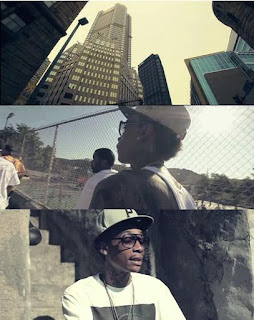 This is a screen shot from the video 'Black and Yellow' by Wiz khalifa. Throughout his video the colour levels seem to have a green/yellow grading over them to create a kind of warm aged look. The style of this grading suits the setting of a hot city environment which is what the video tries to portray.
 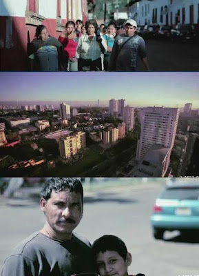 These are screen shots taken from another music video which is actually in our genre. Again the similar theme of city and warmth is applied however there are more tones of blue/green. This effect is called 'bottlewash' in many level editing programmes.
In our video we want to have this kind of effect over some of our footage and so we created a small montage of flips to try this out. We did this by changing the colour levels on imovie shown in the print screen below.
By using this tool of changing levels we created the colour grading/ aged effect on these pieces of footage.
Friday, 23 March 2012
Spinning shot
Whilst doing our research we found this video by Digitalism.
This video is made up of one continuous spinning shot around different objects, movements and ideas. Although it may sound boring it is really interesting the way in which the sequences change with a kind of stop animation feel. Having really liked this we created a similar idea for the end of our video.
We realised at the end of our video our main character is meant to feel confused and a good way to create this dizziness and illusion is to make the shot revolve around her to create the idea of her head spinning and it puts the audience inside her thoughts.
How we did it.
We struggled at first to think of a way that we could move around an object quick enough and then we realised we could use a car. Having our ending on top of a car park was the perfect place.
So we drove around Yasmin and filmed then when we put it in to imovie we sped the clip up.
Wednesday, 21 March 2012
Editing open thing final cut
One idea we had from this video by Metronomy is the opening and the way a moving image appears from the black screen at the very begining.
e>
After much confusion we found a way we could do this on Final Cut Express.
This is a video of us explaining how it is done.
e>
After much confusion we found a way we could do this on Final Cut Express.
This is a video of us explaining how it is done.
Monday, 19 March 2012
Opening so far
We have finished our opening Montage! This is the part of our video that will go before the music starts to add to the narrative.
Audio on montage
For our montage that will go at the start of our video we had to include some sounds of the surrounding area. Listening to other montages it seems that natural sounds such as wind, cars and birds seem common. However we wanted to take in to consideration our themes.
URBAN SOUNDS
Living in a moderately urban area ourselves and not far from the city of London we already had a good idea of the kind of sound we wanted to achiever however we really wanted to set the scene for the rest of our video. The sounds we decided on were
URBAN SOUNDS
Living in a moderately urban area ourselves and not far from the city of London we already had a good idea of the kind of sound we wanted to achiever however we really wanted to set the scene for the rest of our video. The sounds we decided on were
- Sirens - Highlights the area and has a feeling of danger
- Wind - creates tension and drama
- Drones - drones are perfect for thickening sounds
Our next step was to find these sounds, although some are available on imovie we wanted to experiment with some more raw sounds.
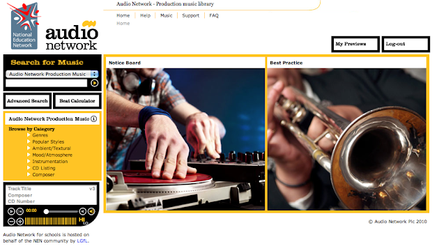
We found the lgfl sound network and discovered some great sounds on it. The site had a huge selection of sounds and we were able to download them for free and use them on the start of our montage.

Sunday, 18 March 2012
Title the futures
While me and joely were researching some new music videos we found this. It is similar to our genre and some common themes being young teenagers and parties.
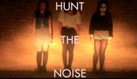
One thing we noticed that we really like is the way their title goes over their opening.
Taking this idea we have done this in our own video over our opening. We also used a similar font as the clear bold writing sits well over moving clips.
One thing we noticed that we really like is the way their title goes over their opening.
Taking this idea we have done this in our own video over our opening. We also used a similar font as the clear bold writing sits well over moving clips.

Saturday, 17 March 2012
Last filming
Today we completed the last of our final filming. These are some print screens of the footage we gained. With good planning we managed to check the times for sunset and get to the top of the building in order to catch the best shots. The urban setting of the car park fits our video well.
Friday, 16 March 2012
Subscribe to:
Comments (Atom)


